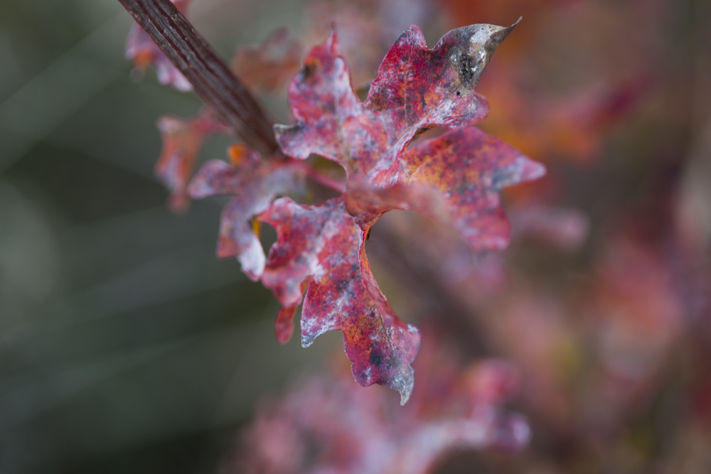
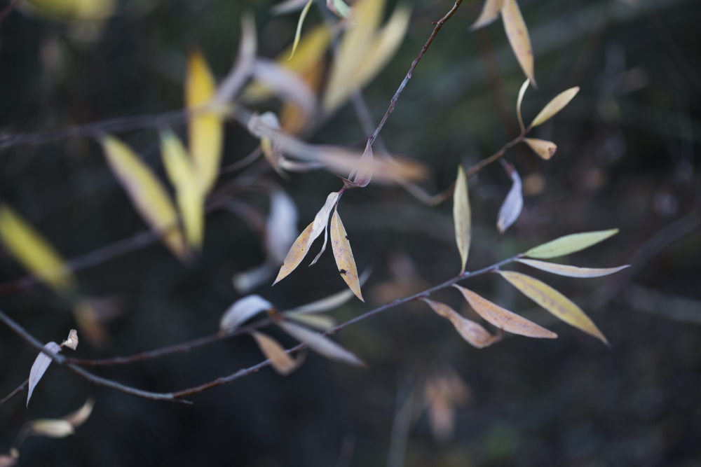
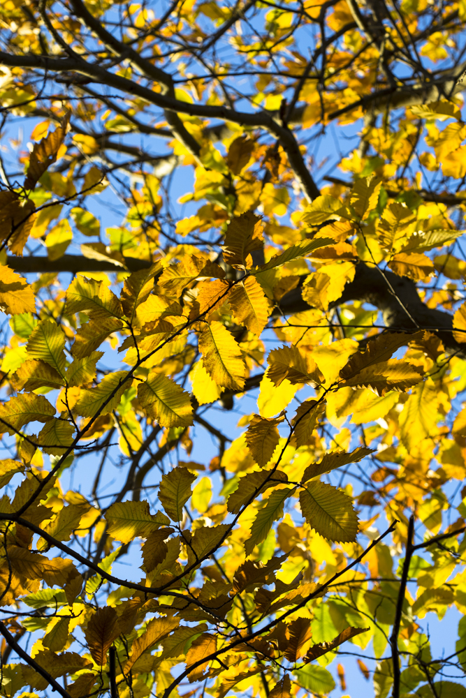
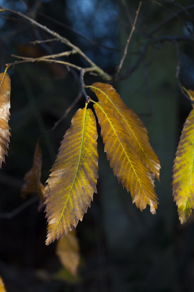
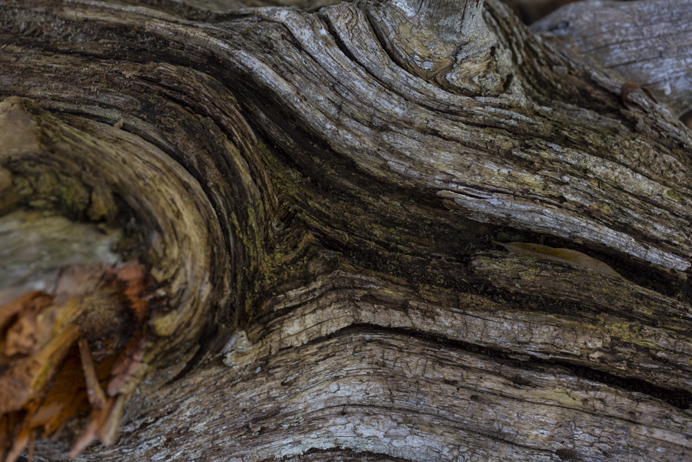
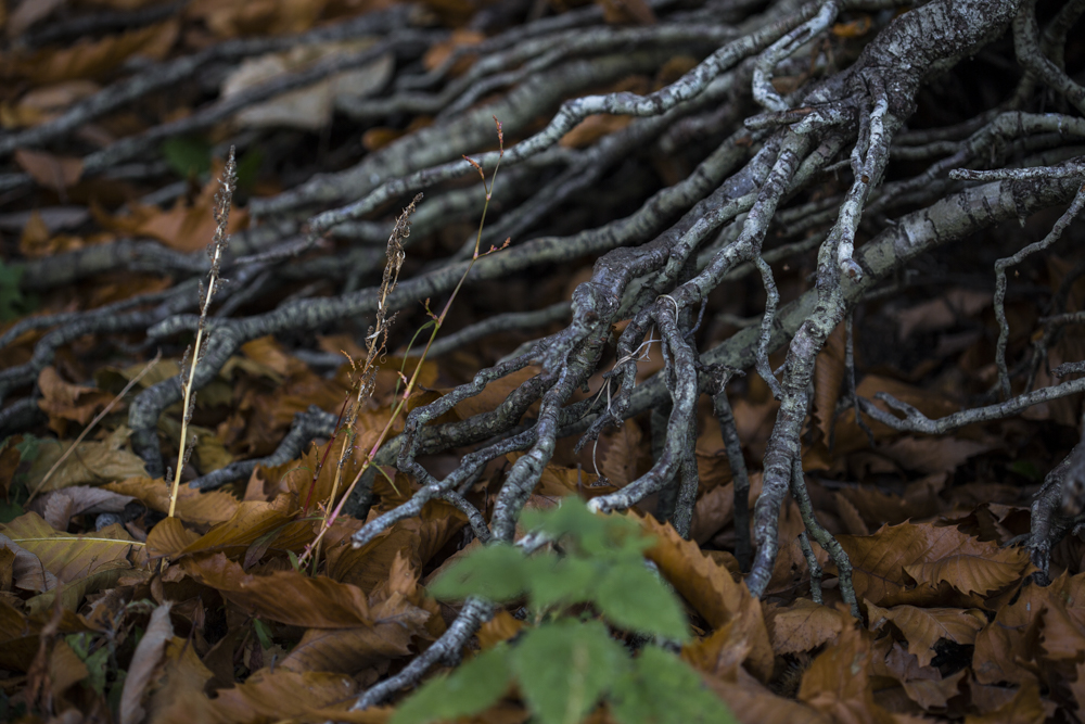
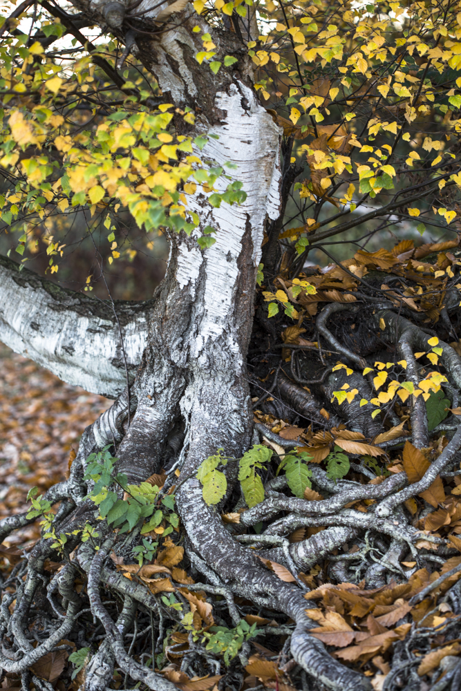
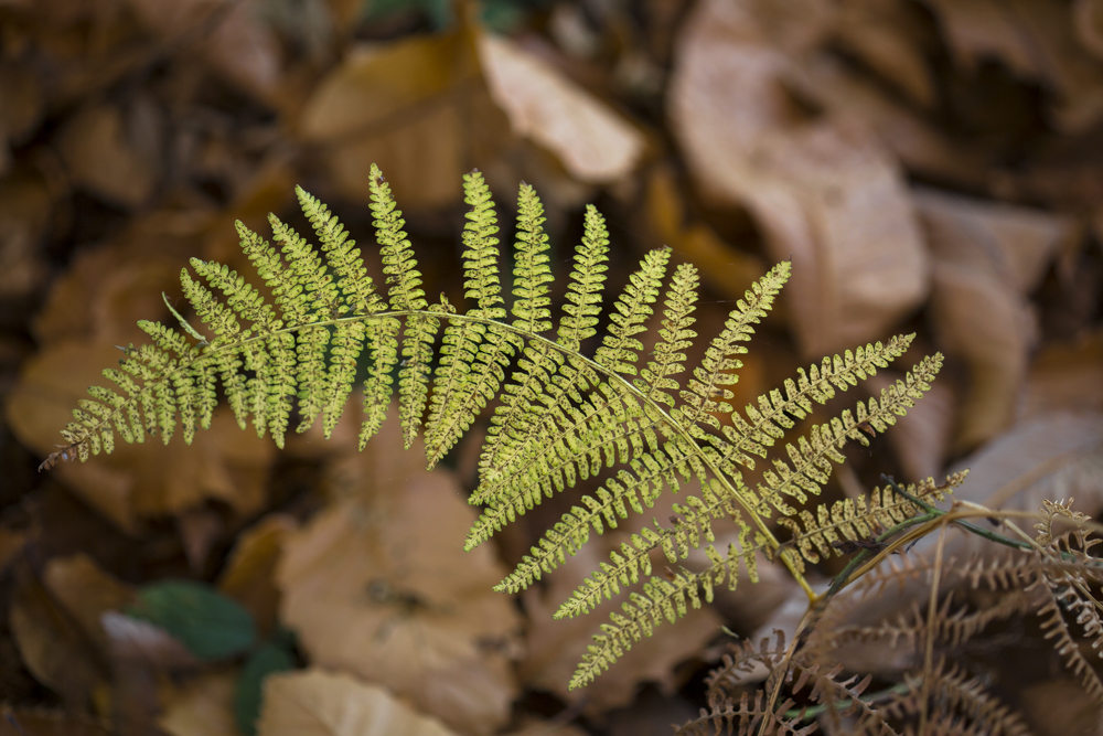
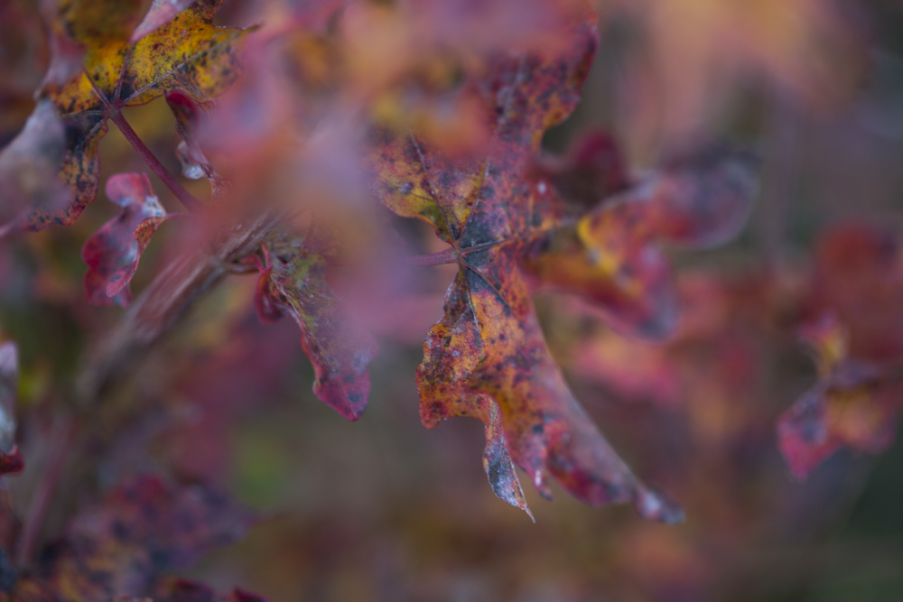
The colours of Autumn…

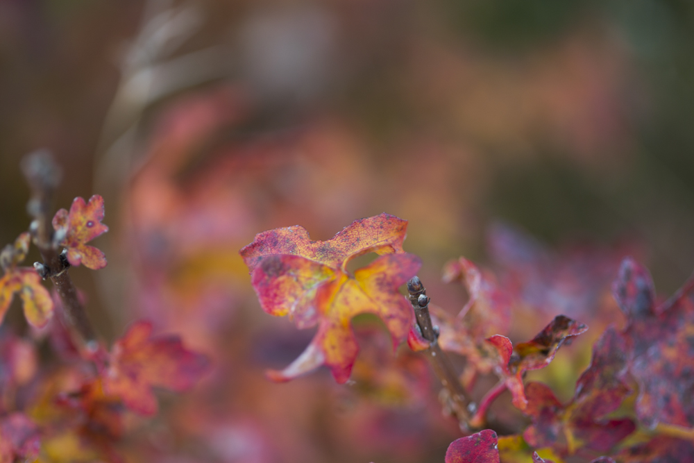
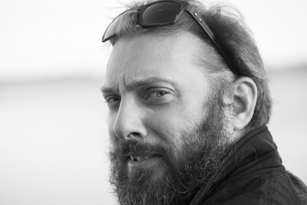
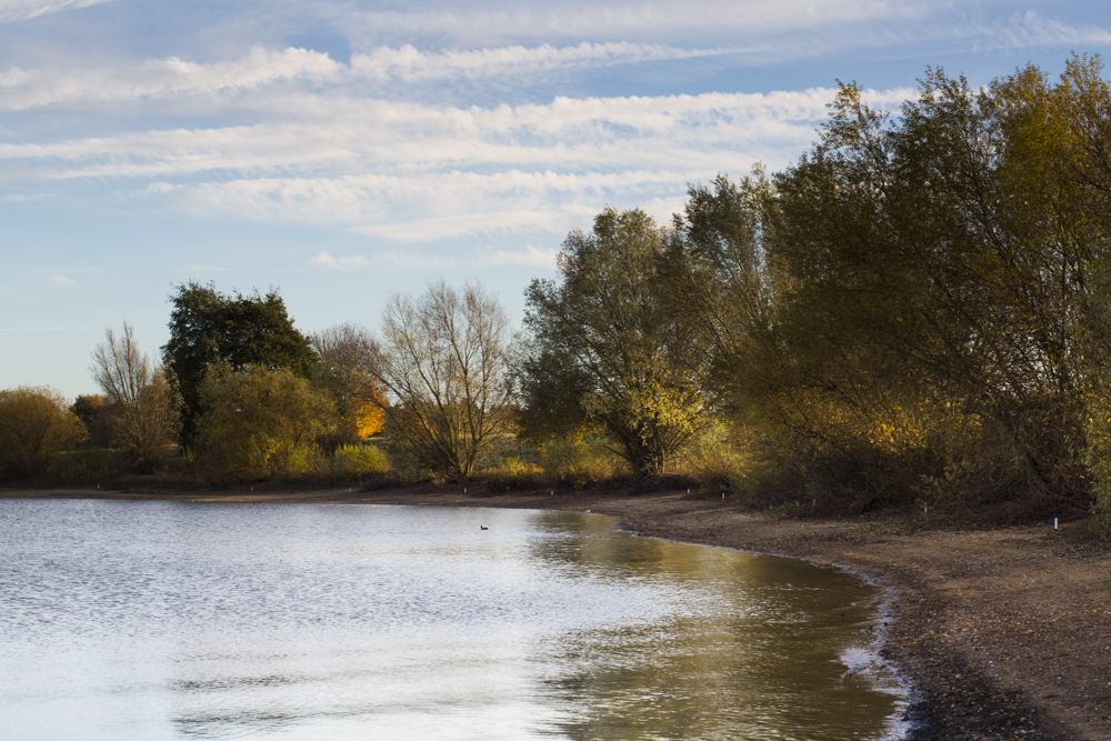
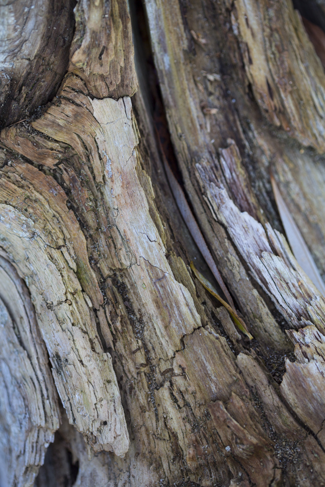
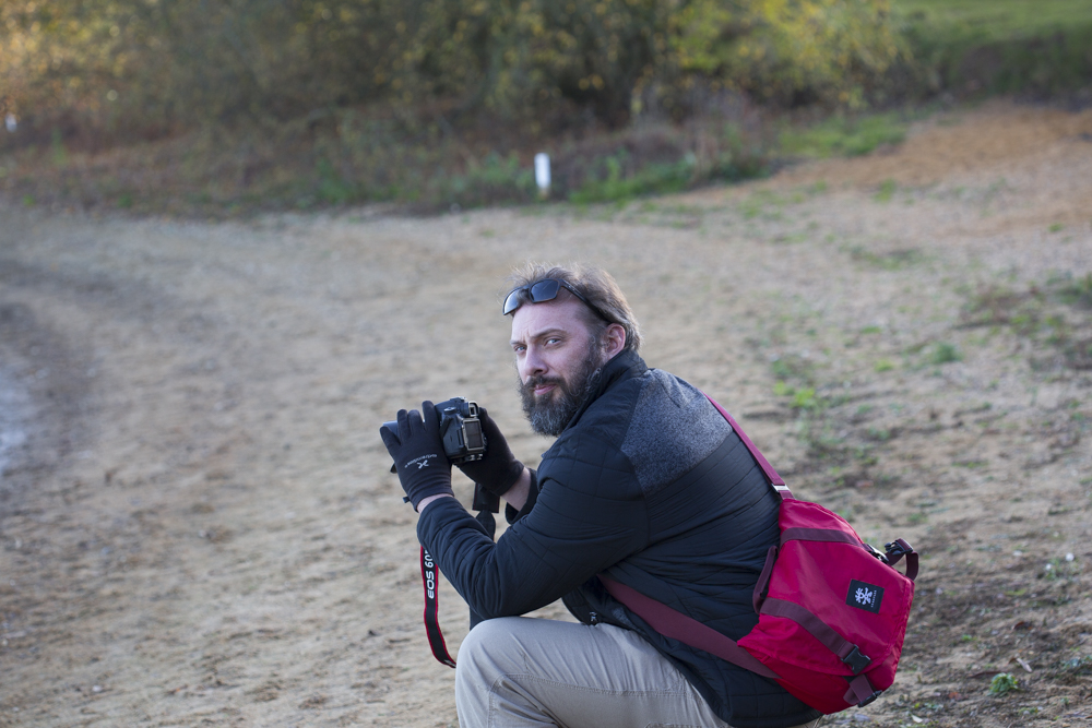
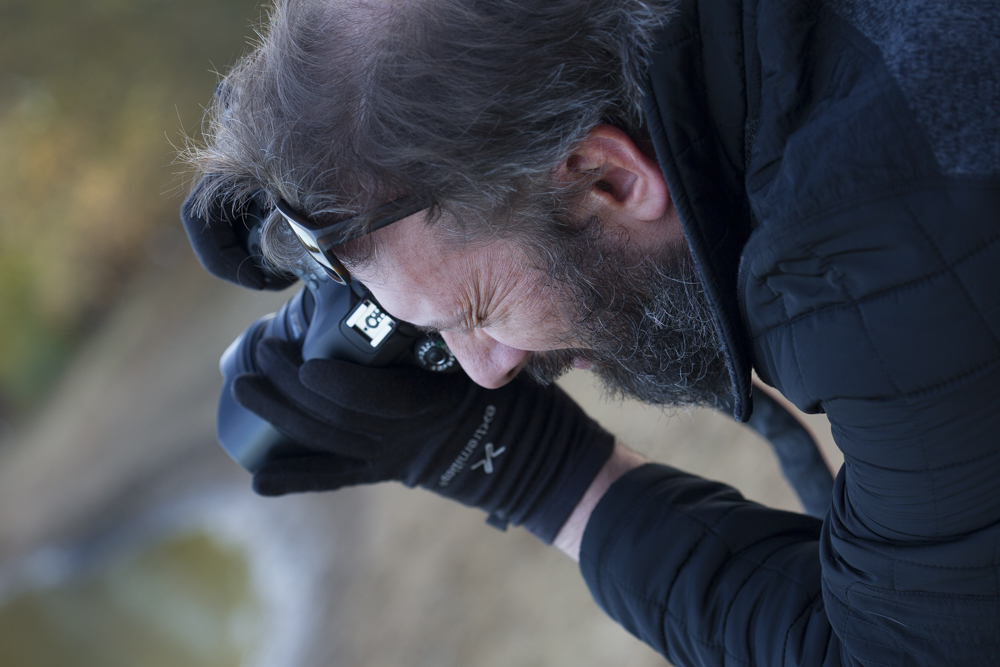
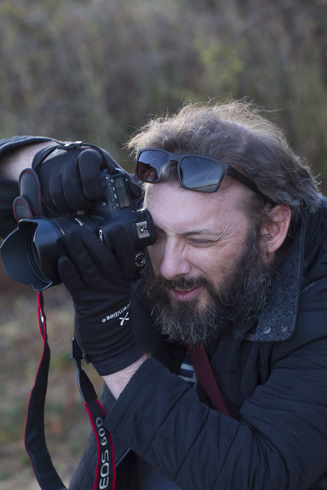
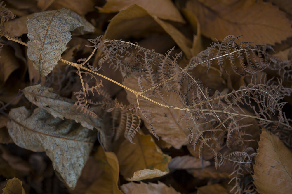
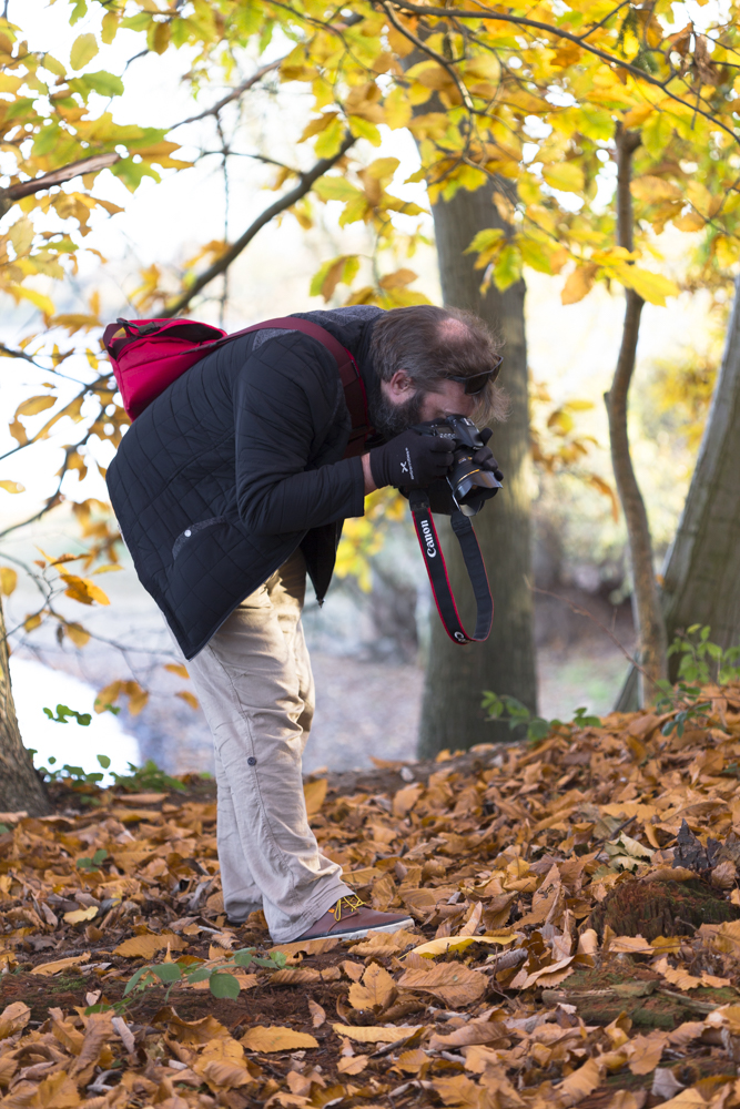
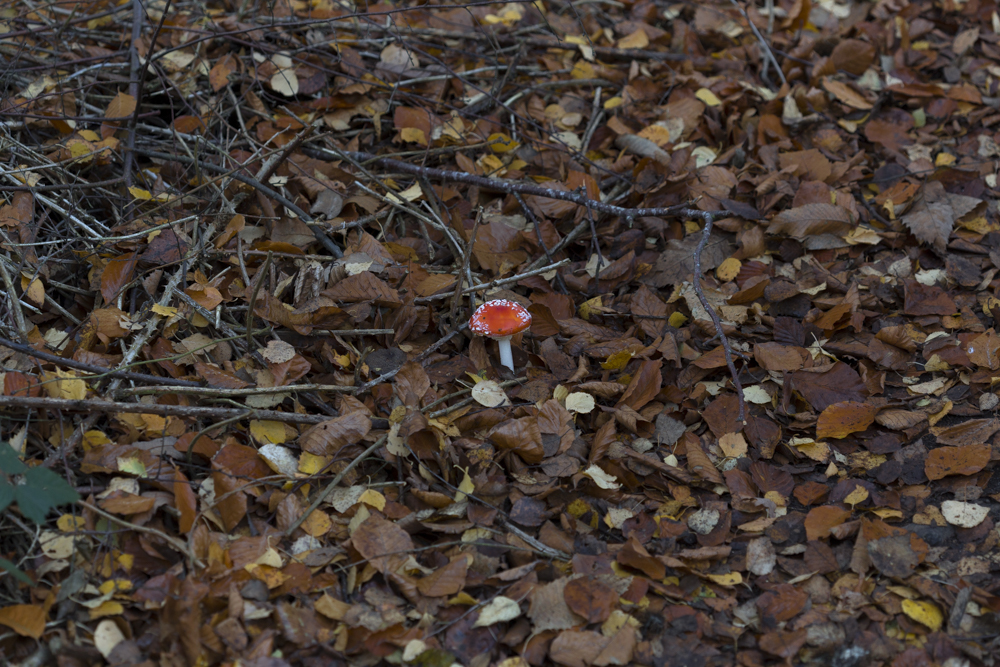
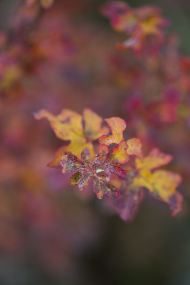
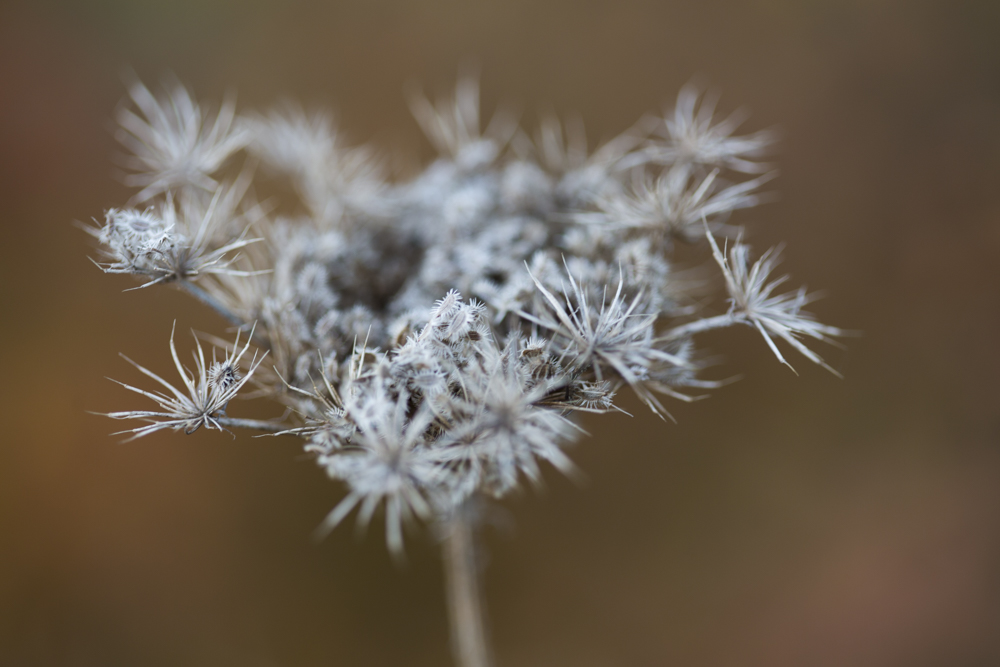
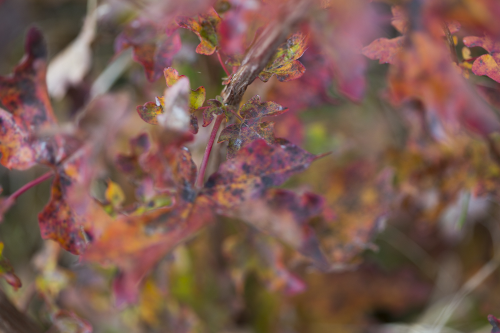
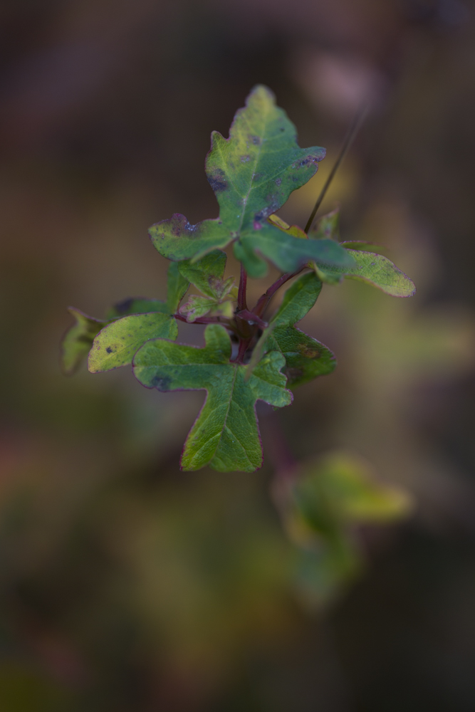
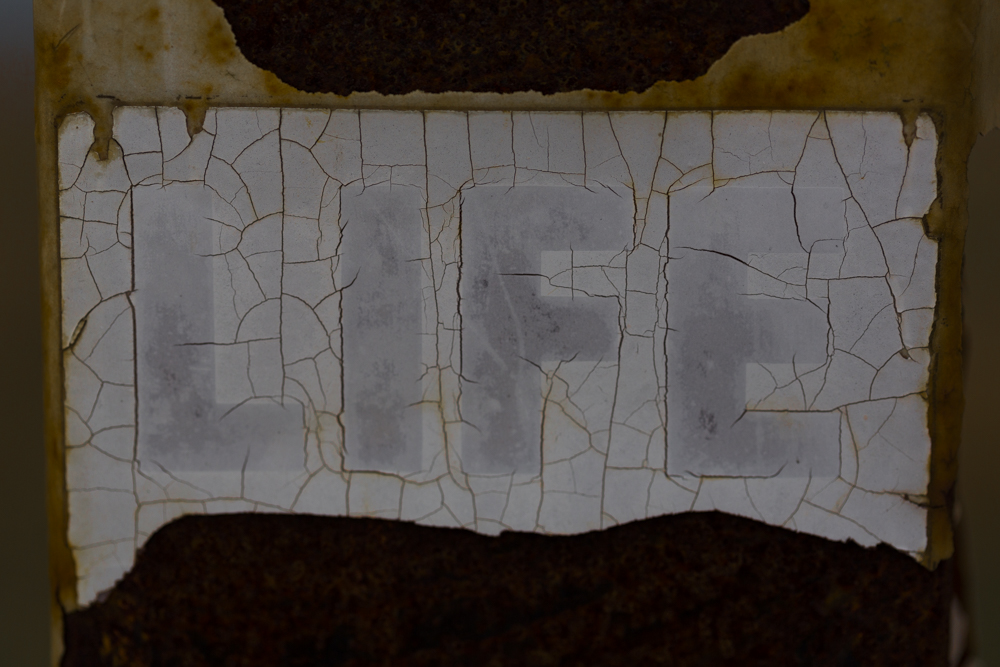
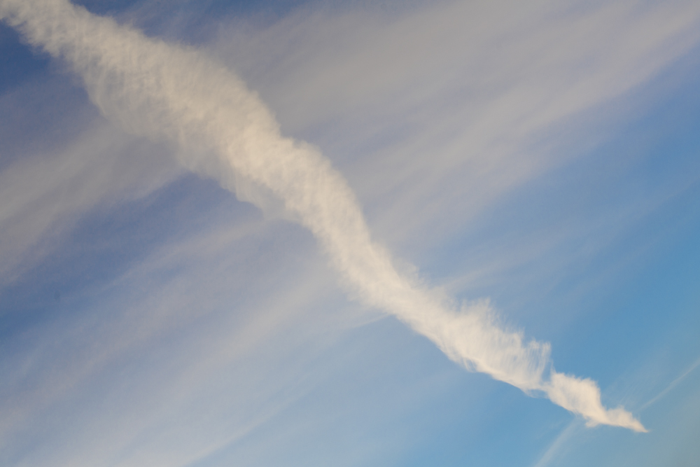
One of my favourite things to do is to go out walking with our cameras using just one lens. A Photographer friend of mine told me years ago that it was a good thing to do, it encourages me to be creative, to get back in touch with a lens I haven’t used for a while and to focus on the subject rather than get hung up on equipment that I have or don’t have on me. Here are a few pics from a walk at Alton Water using my 100mm…


National Animal Welfare Trust – 2018 Calendar

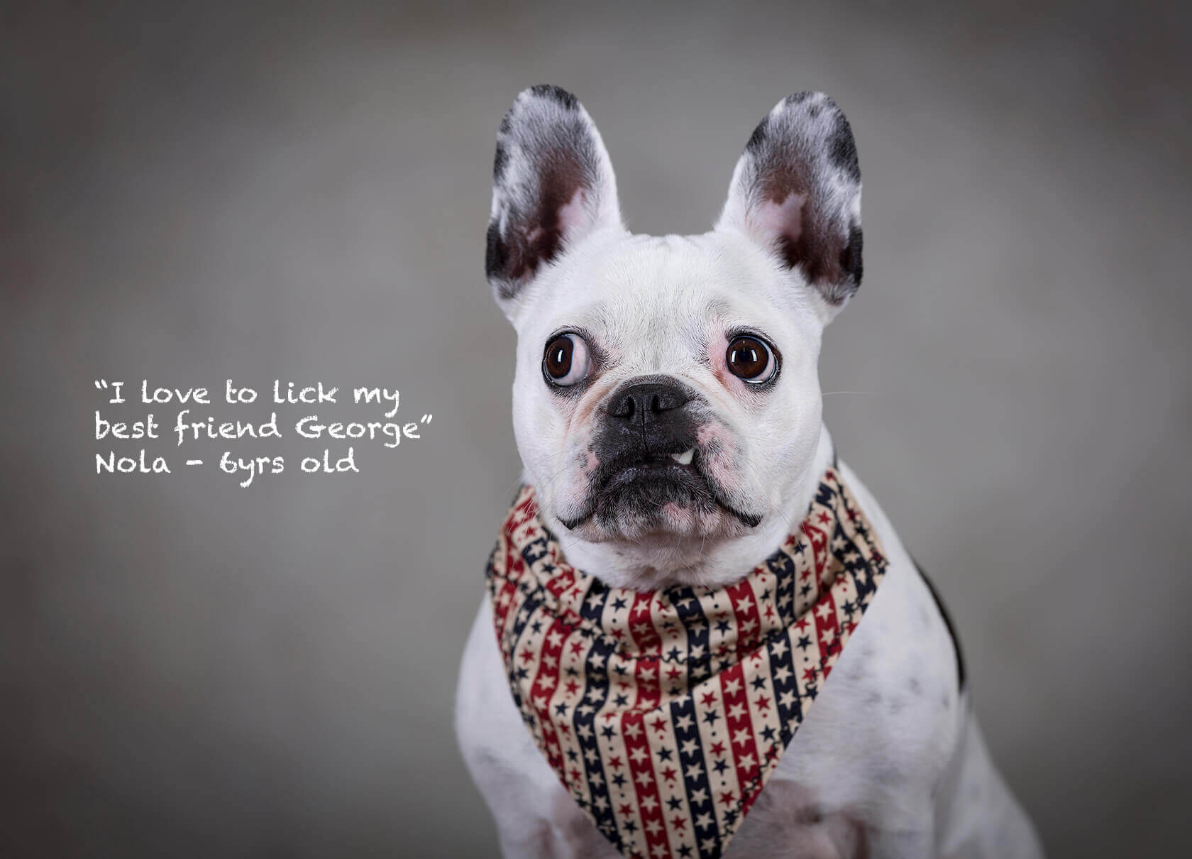
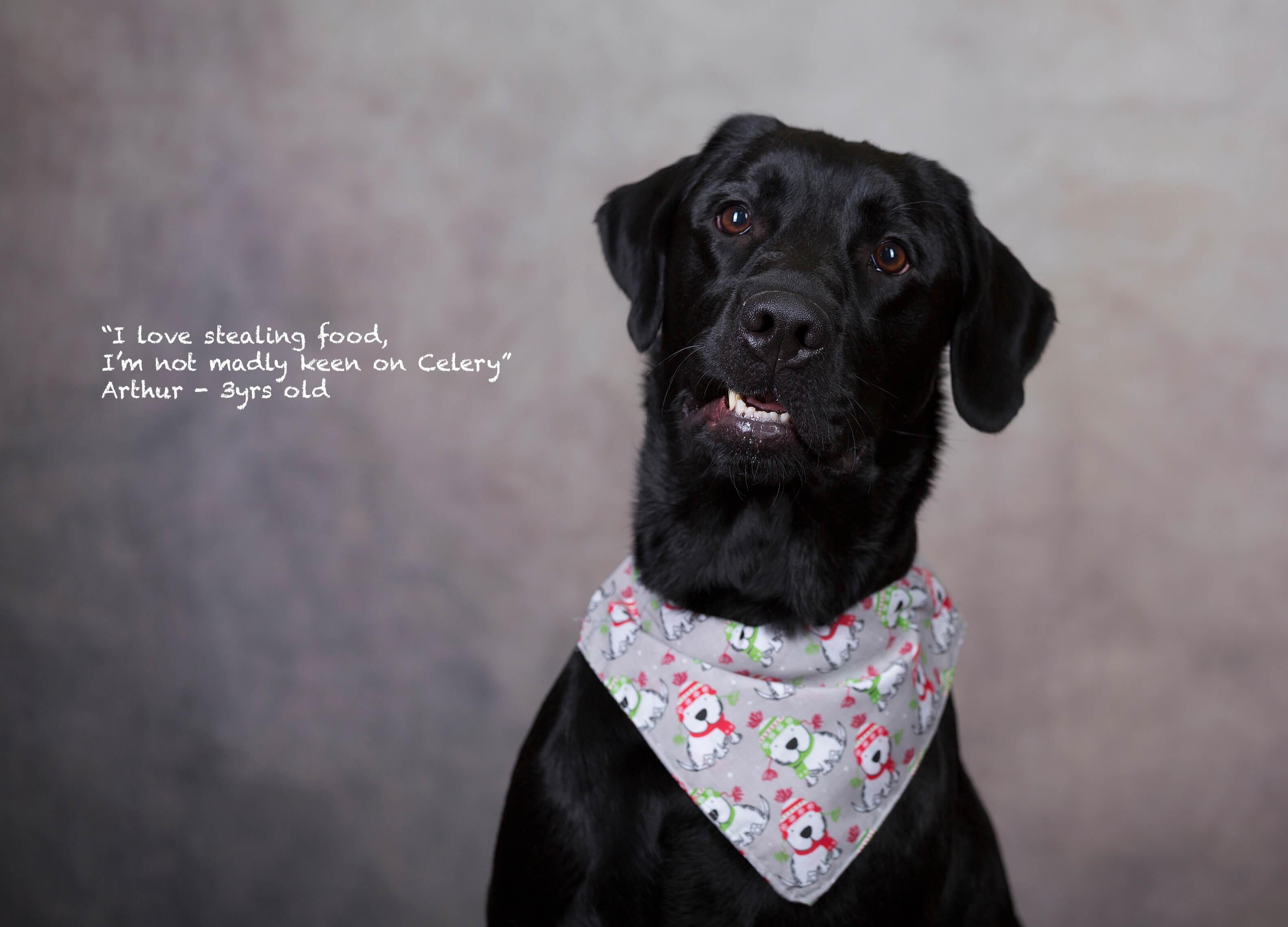
Years ago we used to have rescue dog, her name was ‘Zena’ (her name at the rescue I didn’t have the heart to change it) she was a black lab mix, a big softie, sweetest nature and the best ever companion. We still miss her today she was very much part of our family and I have always wanted to give something back to the rescue to say thank you for our lovely furry friend. So I approached the National Animal Welfare Trust and asked them if I could take pics of some of their rescue dogs for a 2018 Calendar to help raise funds for the rescue which is in Clacton, Essex. They do such an amazing job of looking after and rehoming dogs, cats and other animals if you are interested in ordering a Calendar and supporting this great cause please contact them or drop me a line. All funds go to the NAWT rescue centre in Clacton.

Here is Arthur one of the rescue dogs who has now found his forever home.

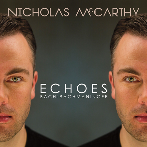
Woohoo Nicholas McCarthy’s new album cover!

I know it’s been a while since I added a blog post, after a busy summer I took some time off and lost myself on a boat on the Norfolk Broads and loved a week away on Rhodes cycling to deserted beaches and eating lots of greek salad. Now I’m back having switched one of my labels from being a ‘smoker’ to being a ‘vaper’ I have also had my haircut and am seriously reconsidering the gym!

So a little piece of news ( which I am really chuffed about) is Nicholas McCarthy (Pianist) has chosen to use one of my images to use on his new album cover Echoes which is out now he is also on tour see more info here.

Head shot’s

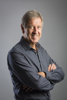
If you, like so many other people have chopped up an old photo from your hols or used an image taken on someones phone at a family do to use for your profile image on your social media then please stop and think what this says about you and your company. It’s great to come across as accessible and friendly but some might look at your image and see it as not bothering and possibly slightly unprofessional. I like relaxed and quirky shots for profile pics I’m not saying every company suits a formal look but if you are going to have a picture then choose wisely, get it taken professionally. We all like to see who we are dealing with and like it or not we do make judgements on what we see, make sure the judgements people make are the right ones about you.

Click here for more info and prices.

One daughter, a vape one fan and one light

Sometimes I get so caught up with working and doing Photography for other people I forget to take time out to just be playful, get creative and experiment with ideas. I have decided that I need to do this more than I have been, so with the help of my daughter ‘Hope’ we are going to plan some creative shoots. Here are a few from today, I just wanted to start simple and take some time to experiment with light and darkness, shape and form. We used a black backdrop, one light sometimes a piece of white card (as a reflector) a fan and a vape! As is often the case with Photography sometimes the unplanned shots are more interesting than the shots you intended to take so I included a few below.
 

Studio Photography Colchester

Sleeklens- Reviewing ‘Strike a pose’ portrait presets and brushes for Lightroom

Loading the presets and brushes was pretty straight forward, I thought I knew how to do it but couldn’t quite remember the steps. I was glad that Sleeklens had sent me over very clear instructions on how to load them into Lightroom. The package comes with 70 Presets which include all in one changes to your image, base changes, exposure adjustments, colour correct, tone/tint, polish and one of my faves vignette and 62 brushes include all kinds of handy make-up tools from adding eyeliner to defining hair.

Once I knew the presets and brushes were loaded I chose an image taken outside and a studio shot to see how I could use the Sleeklens Portrait workflow to enhance my images.

Original Image:

I wanted to brighten the image above as it all seemed too dark so in the Presets on the left hand side of Lightroom I applied ‘Exposure-Brighten’ then wanted to warm the image up a little by adding ‘Tone/Tint-Warm-up’ then added ‘Vignette- Black Dreamy’ to bring the attention back to the centre. The Presets are easy to apply you can just click or undo if you don’t like the adjustment you just made you can go back either in the history panel to the left of Lightroom or go to ‘Edit’ top left and click ‘undo’.

I am not sure if it is just my wheel on my mouse but when I clicked on the brush tool I have to use the up and down arrow in the brush window I can’t use the wheel on my mouse to scroll through the brushes which takes a bit of extra time and is more clunky than just scrolling up and down the choices, but I think that might just be my mouse it is quite old after all!
I used the brushes on the right hand side to choose some finer adjustments I wanted to apply, I darkened the dog and and black trousers by using the ‘Darken Shadows’ brush I also added some extra saturation with the ‘High Saturation’ brush to apply on the right of the picture just to bring it a bit more to life. I also wanted to add a bit of a golden glow in the gap in the trees as that looked a bit pale and washed out so I used the ‘Haze-Golden’ brush and just painted circular brush stroked to add some sunny warmth to that gap in the trees.

I also used the ‘Base- Auto Tone Black & White’ preset as I wanted to see what the black and white would look like. Black and whites can vary so much but I liked how this one converted using the preset often they can be too bright or too dark so you have to tweak until you get the tone you are happy with but I was pleased with this result.

Next an image I took in the studio, I chose an image which was very shallow depth of filed and almost washed out in appearance. I wanted to see how I could improve it and bring it back to life.

Original image:

The first things I applied from the presets were ‘Auto Tone’ preset which instantly gave it more oomph and depth of colour, I added the ‘Vignette-Black Dreamy’ to add more contrast to the edges of the image then used several brush tools to enhance the face.

I used the following face brushes to add some extra definition:  Reduce Wrinkles,Rosy Lips, Define Blonde Hair, Portrait Punch, Darken, Add Contour To Cheeks, Add EyeLiner, Reduce Highlights, Subtle Smooth Skin, Sharpen Face (to brush over her eyes). The image now looks warmer and has more depth without losing it’s soft feathery feel.

I was surprised by the number and variation of the brushes, I like how they are grouped into categories so they are easier to find. It meant I had to spend less time going to Photoshop and back as I now have a better selection of tools within Lightroom which are so easy to use. I tried using the presets and brushes on other images and found they can be used for all sorts of portraits inside and out, I am chuffed with my Sleeklens presets and brushes as they give me fast easy options to use with my Portrait Photography but also my Boudoir and Family Photography.

To find out more about Sleeklens go to – Tutorials, Presets, Pinterest.

Business head shots don’t have to be formal & stuffy

Thomasin is an image and style consultant who is based in Essex but works with clients all over, she wanted some images of herself to use on her social media and website which showed a mixture of themes from the classic smiling head shot to her playing around with different styles and looks to tell a bit of a story about what it is she does for others. Please read more about her here and find out how she can help you to ‘look good and feel great’.


Flat lay product photography for Sand & Salt

Here are few examples from a recent flat lay ( also known as over head or knolling) shoot I recently did for Sand and Salt a local company who sells beautiful towels and bags.